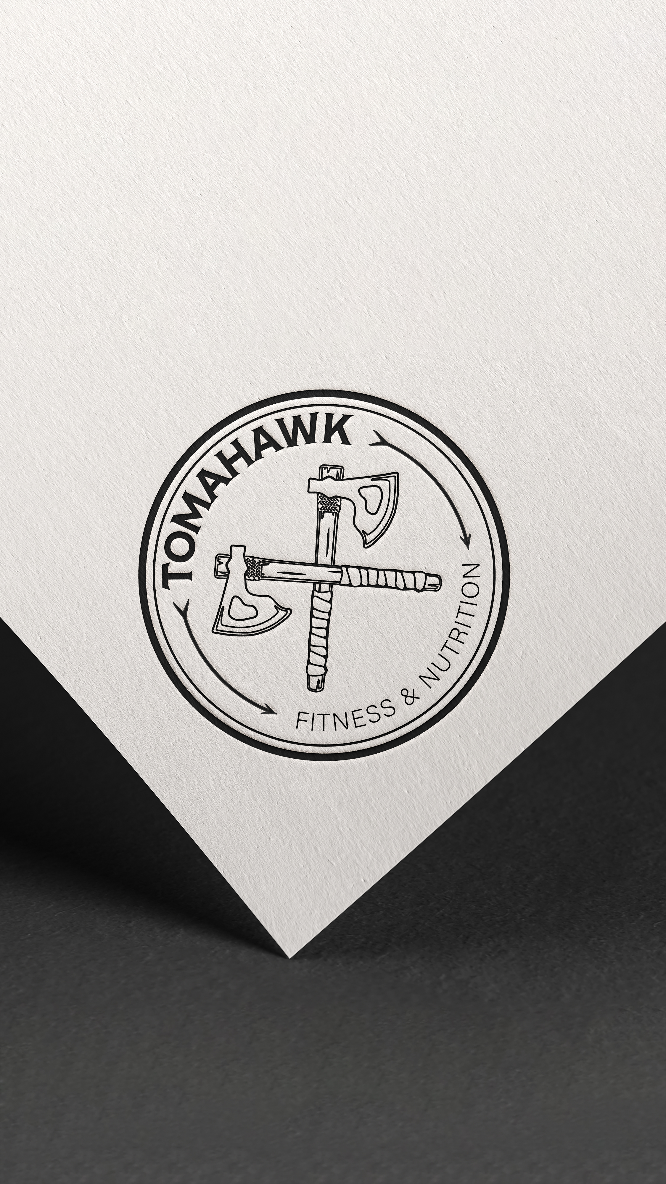
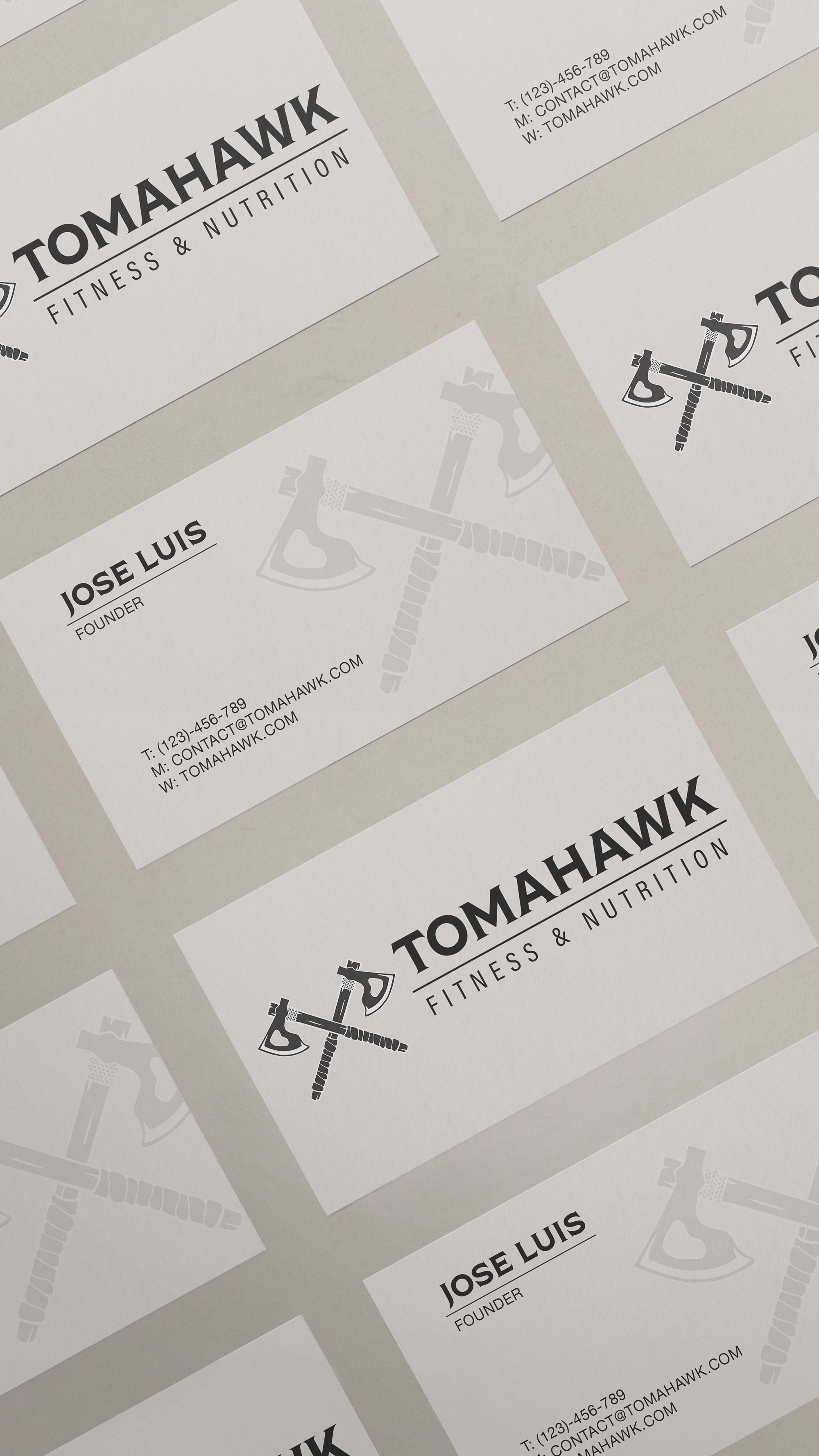
The proprietors of Tomahawk Fitness wanted to introduce a new aspect of their business: fitness consultation. They were interested in pursuing this direction due to their previous success with the original brand design. By reinterpreting the major existing elements, simplifying them, and doubling down on the style, the outcome is a streamlined and clean reimagination of their existing logo. One significant change includes the simplified and full view of the tomahawk, with an additional tomahawk representing the other part of the firm. To complement the shape of the tomahawk, the typeface used for "Tomahawk" is modified to a thick serif type, accentuating the taper at the end of the letters. When identifying the area of the firm to which the logo refers, a simple sans-serif type font is utilized within the business name.